Supporting municipal objectives and services through visual communication
From 2013 to 2018, I worked as an in-house graphic designer for the City of St. Albert.
These projects included city budgets, business attraction and tourism, recreation and park services, and arts festivals. Here are some of the highlights.
WITH
City of St. Albert
Smart City Master Plan - Summary Version
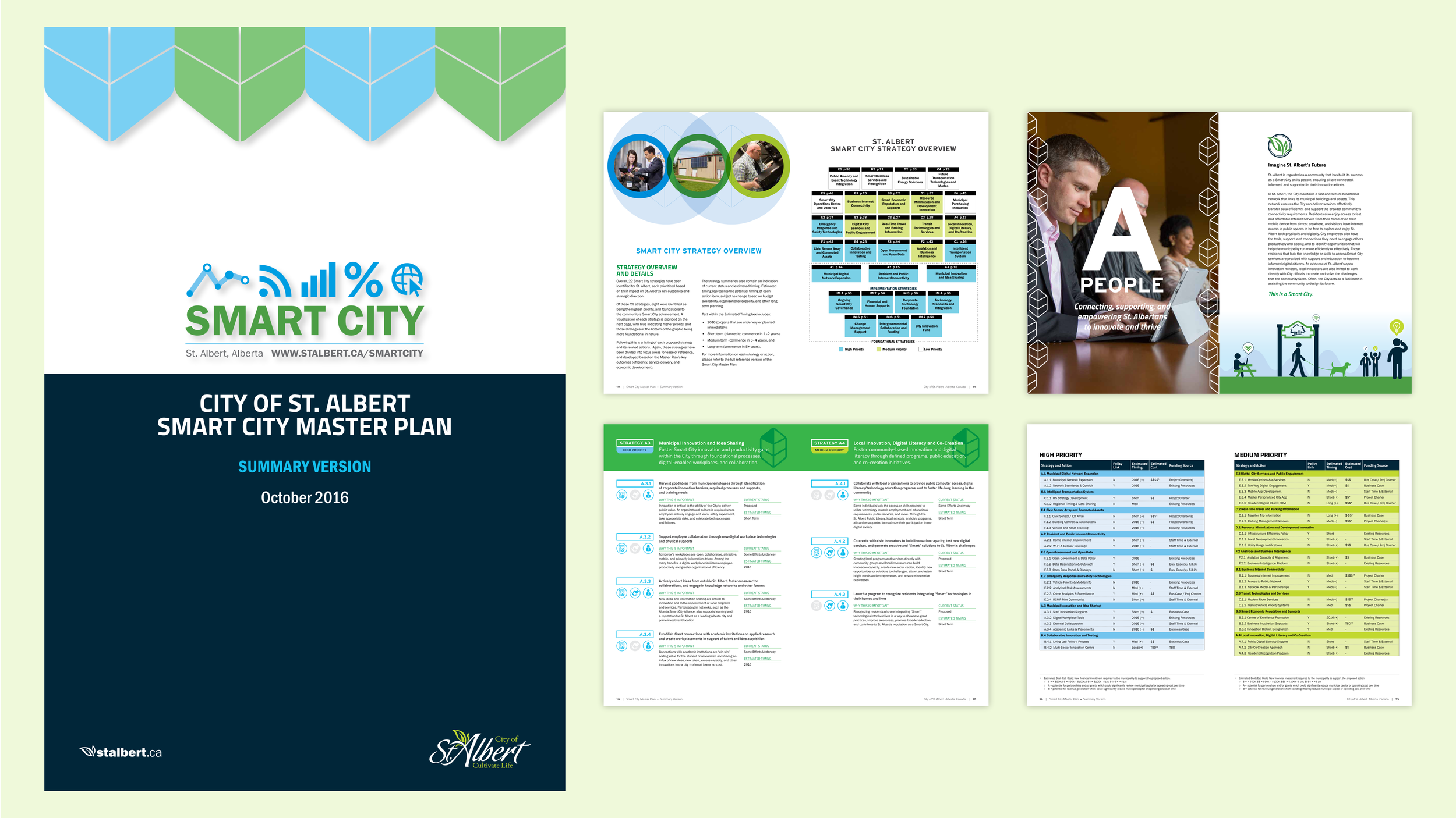
The Smart City Master Plan was a part of an initiative to establish itself as a “smart city”. The original document was a comprehensive government policy and I was tasked with creating a summarized version to share with external audiences.
I addressed the complexity by chunking information into smaller components, and using a leaf icon to support content navigation through the report. I adapted icons from the original document to maintain a visual link between both versions of the policy, and added bold and vibrant colours from the city’s brand to contribute to the sense of excitement about the future.
2014 Census Report
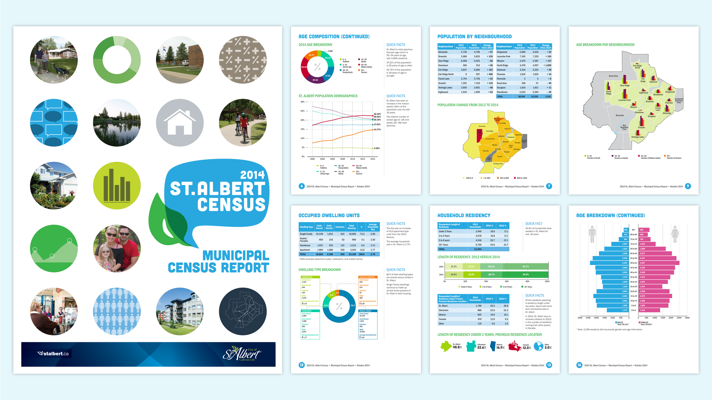
The census report was designed to present municipal census data in an engaging format that was accessible to the general public. The public report focused on population demographics, housing starts, and neighbourhood growth.
I designed the report with visual interest and legibility in mind. This meant foregoing the standard tables and charts in favour of creating colourful and impactful ways of depicting information. I collaborated with a business analyst to ensure the data was accurately depicted, and we introduced a “quick facts” section to provide a brief interpretation about what the data meant to the city’s residents, turning numbers into relevant stories about growth and its future impact on community planning.
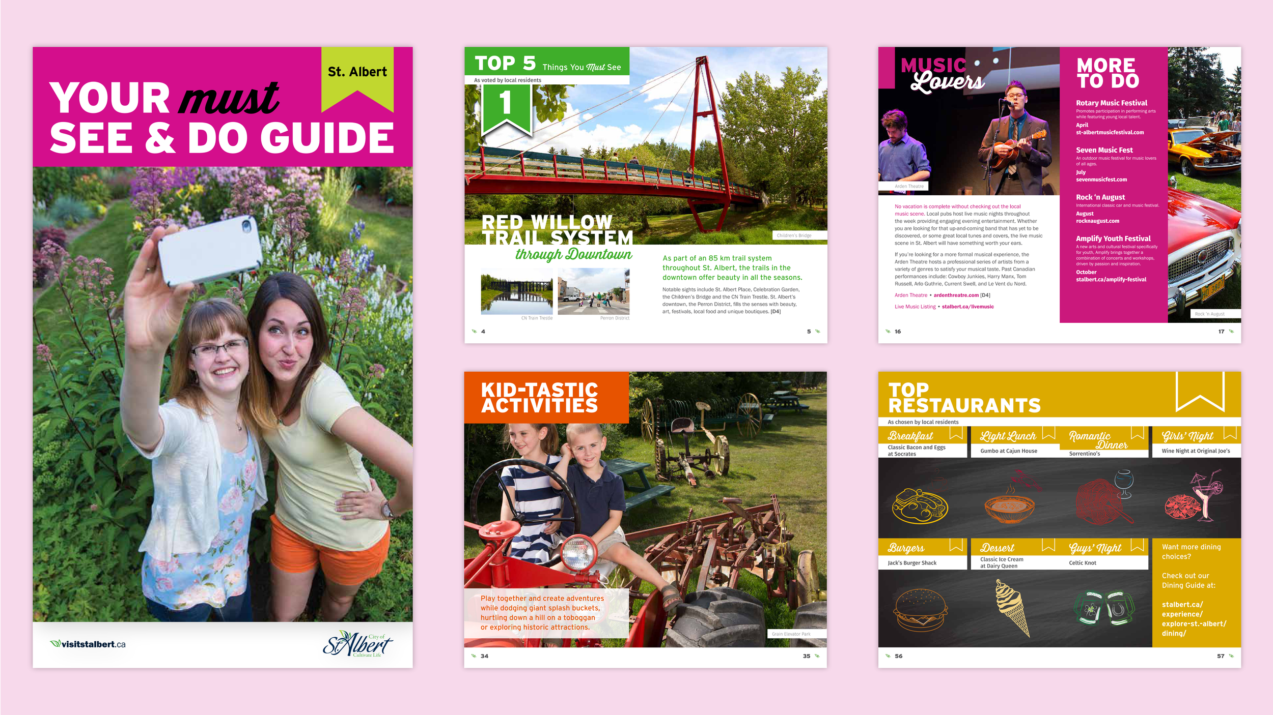
St. Albert Your Must See & Do Guide
The St. Albert Must See & Do Visitor Guide was created to support tourism by featuring experiences for visitors seeking cultural adventures. Based on the city’s market research, we focused on targeting “cultural explorers” who wanted to immerse themselves in local history and try new things off the beaten path.
I designed the guide to illustrate curated experiences through vibrant photos and bright colours to create feelings of excitement across different types of activities, such as nature walks, historical museums, or taking in the sights and tastes of downtown dining. We prioritized visuals over text so visitors could peruse the guide and quickly identify things they want to experience.
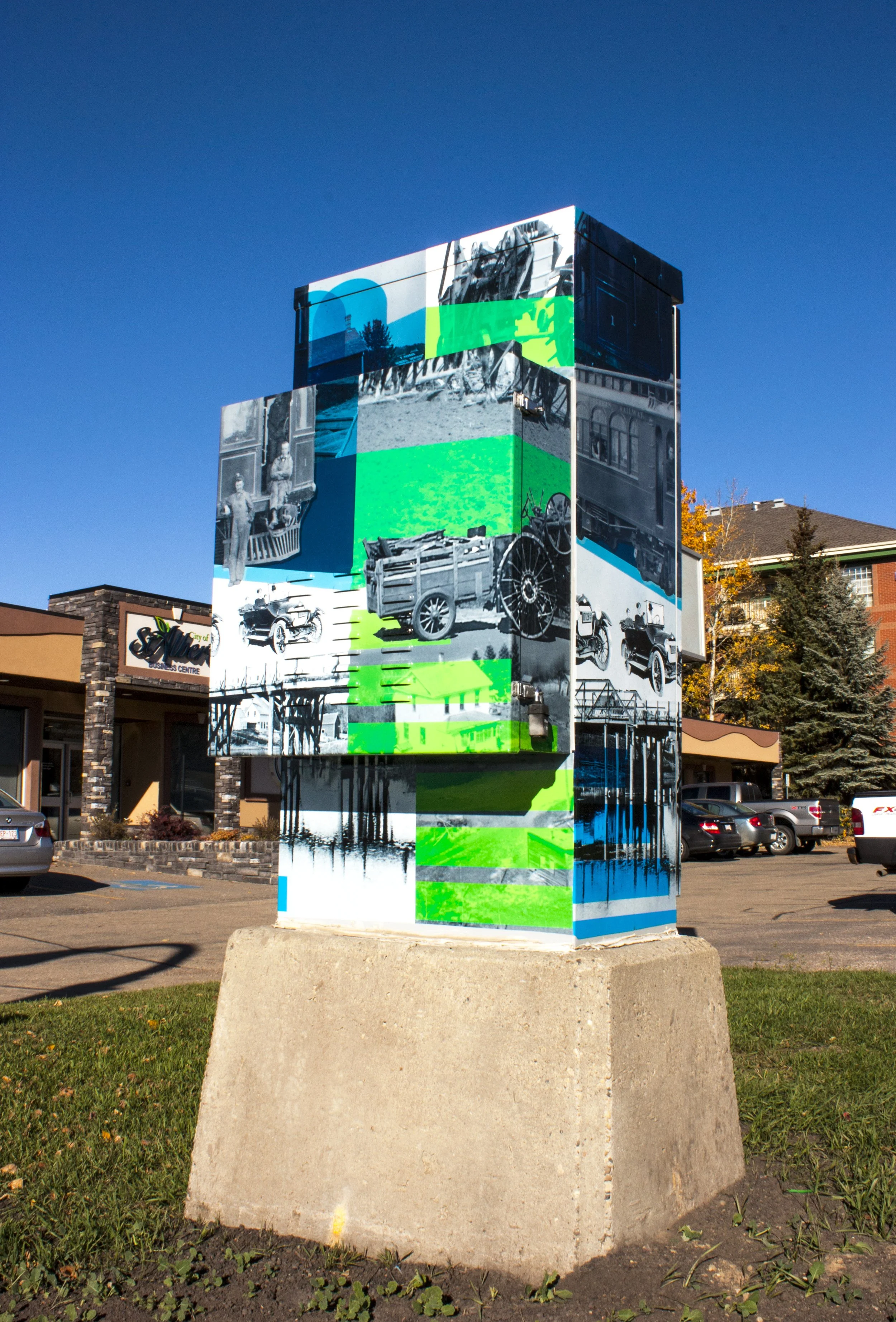
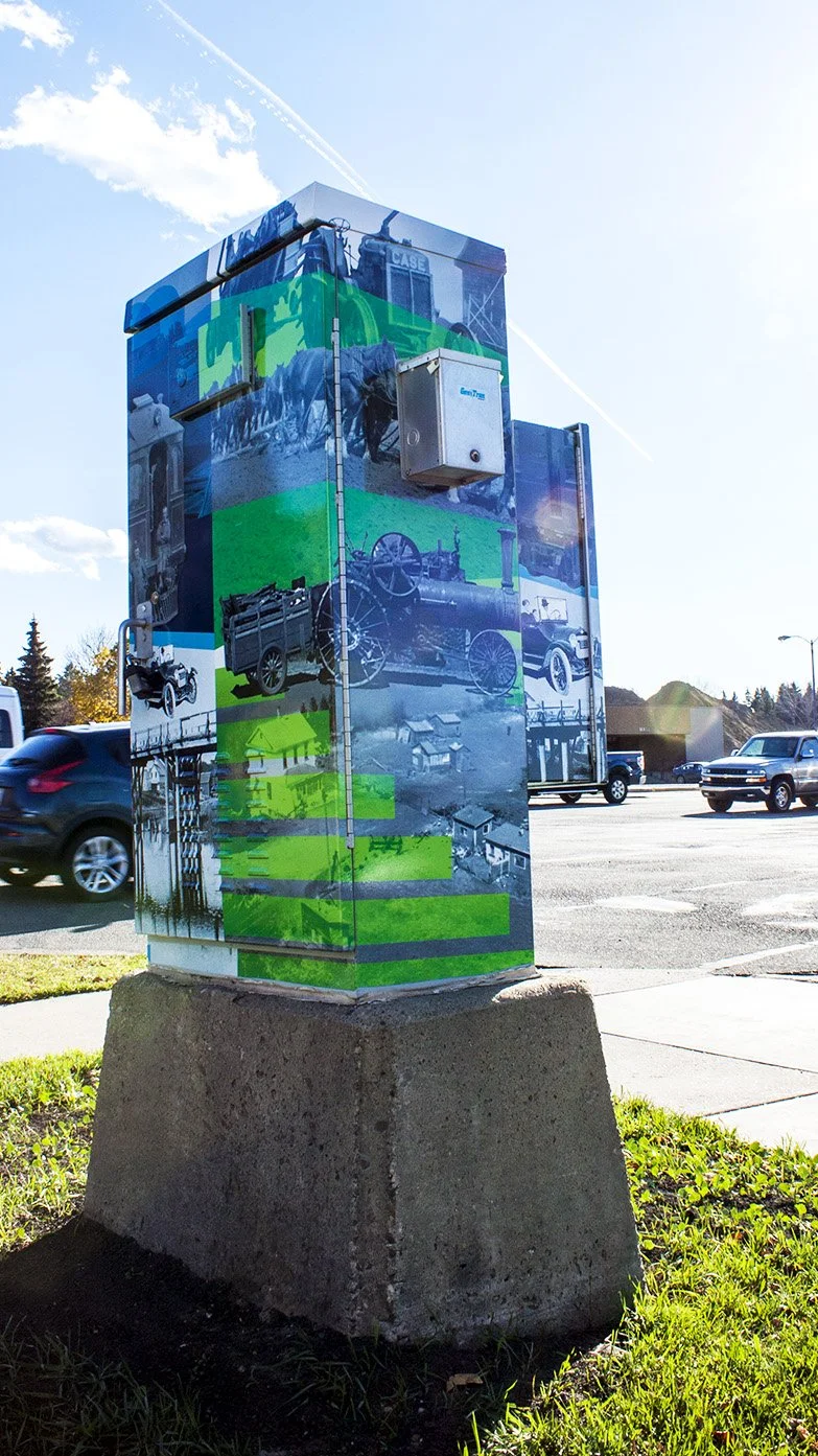
Utility Box Anti-Graffiti Wrap
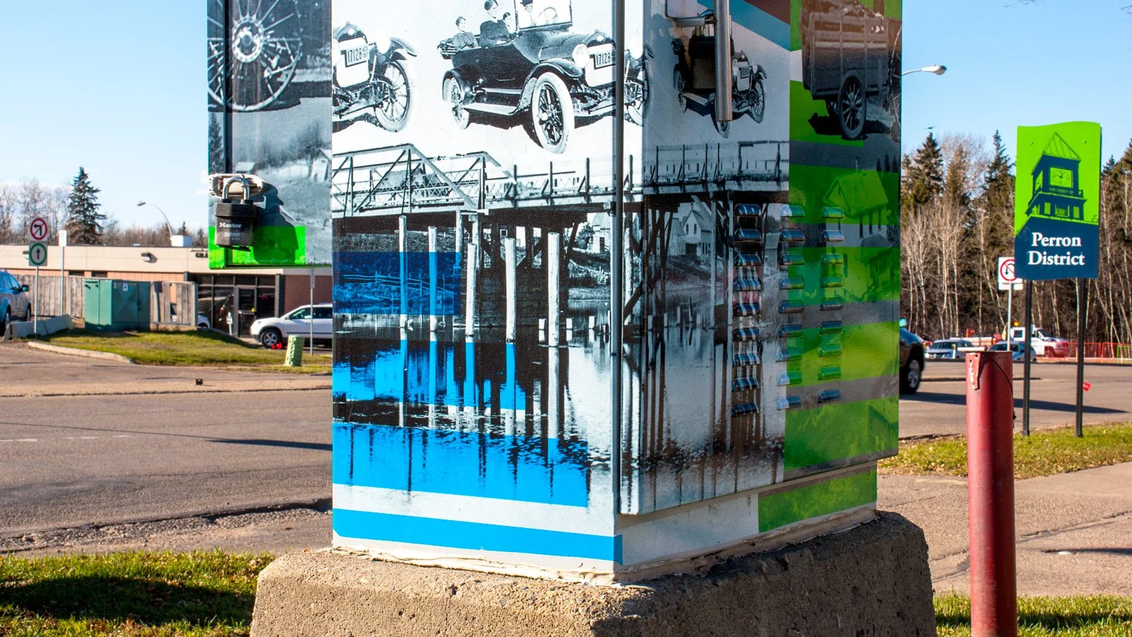
The city has an ongoing program to deter vandalism and graffiti in the community, including the tagging of city property. Similar to other cities, St. Albert installs vinyl wraps on utility boxes throughout the community to promote a cleaner looking neighbourhood.
I worked with the local museum to gather archival images and designed a vinyl wrap themed on agricultural and road transportation. I used colours from the city’s brand to create depth and dynamism with the photographs, resulting in a two-sided collage that was visually interesting and busy to meet anti-graffiti objectives.
Douglas Cardinal Boardroom Sign
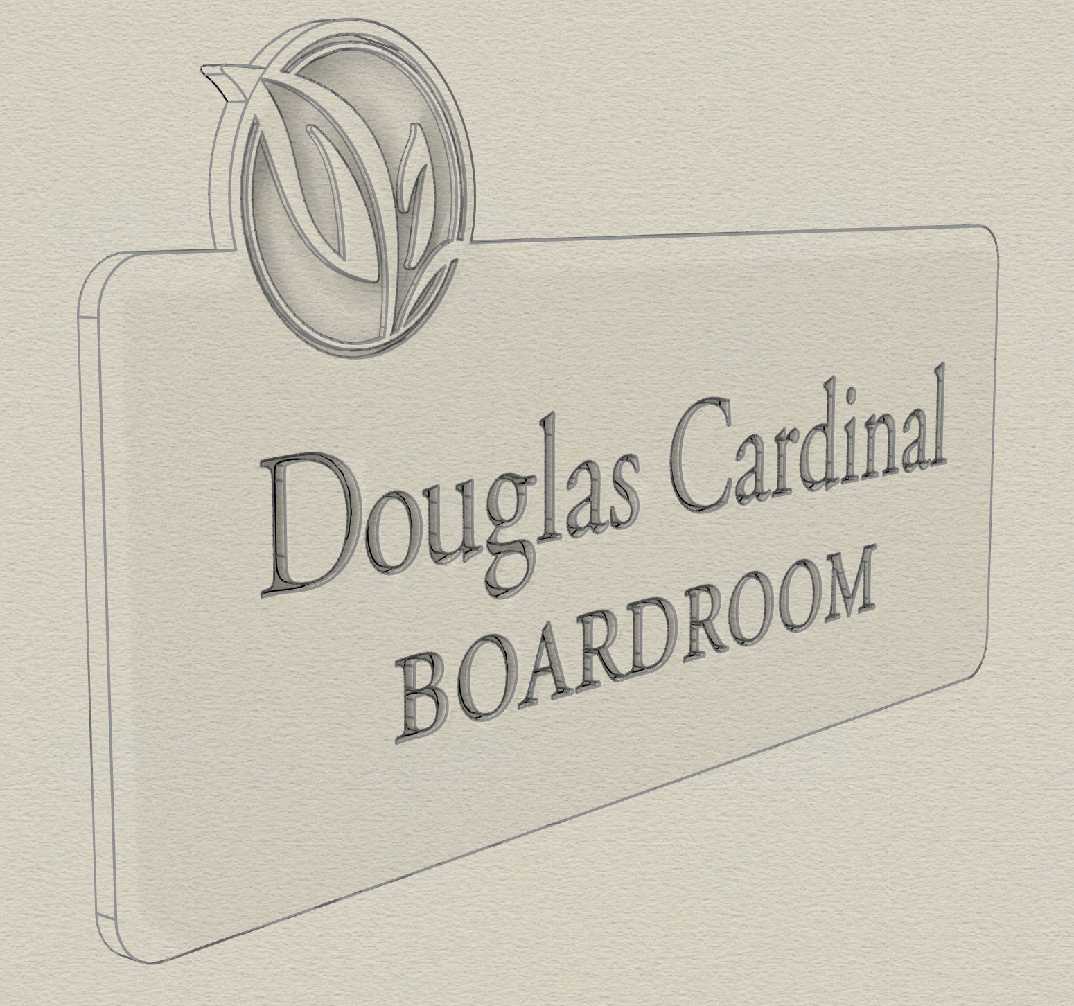
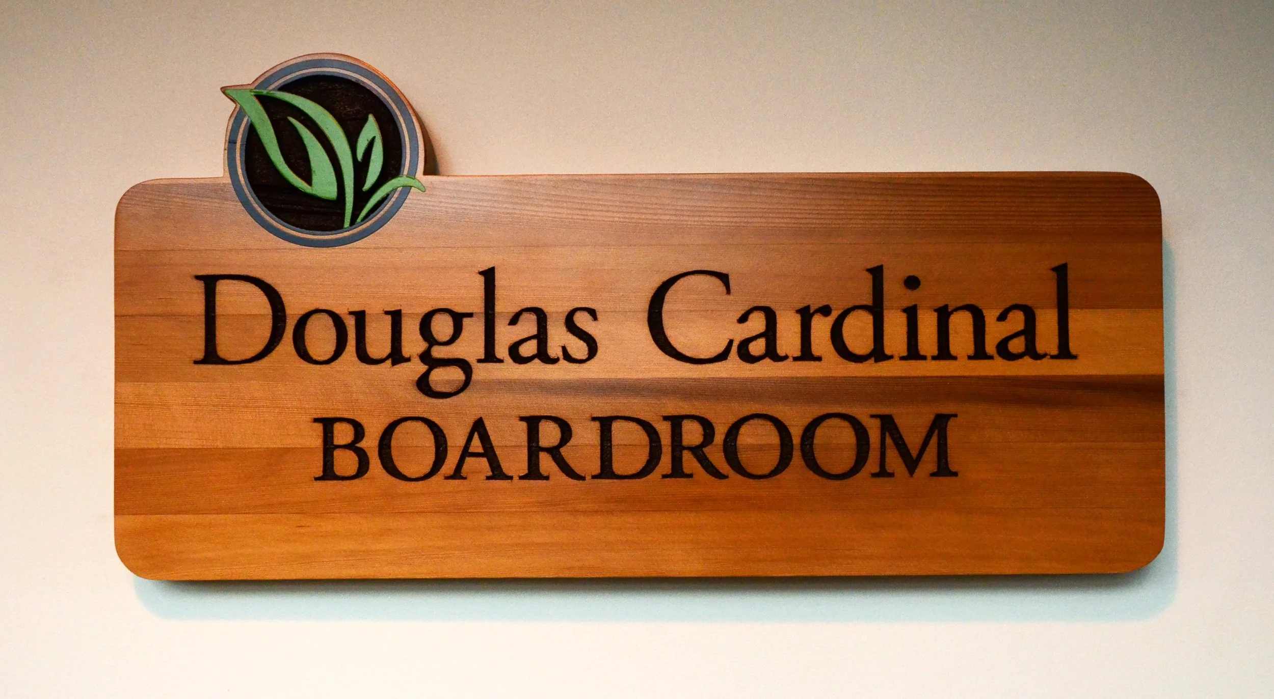
In 2014, St. Albert Place (City Hall) celebrated its 30th anniversary by dedicating its largest boardroom to the building’s architect, Douglas Cardinal. This commemorative sign bore the new boardroom name and reflected its prominence in civic engagement. The materials used connected to the building’s interior, with the classic wood finish complementing the darker wood and brick tones used throughout the space.
This project helped to establish standard guidelines for city signage, and set a precedent for future projects with signage being approved more efficiently.
Servus Place Wayfinding and Recognition Wall
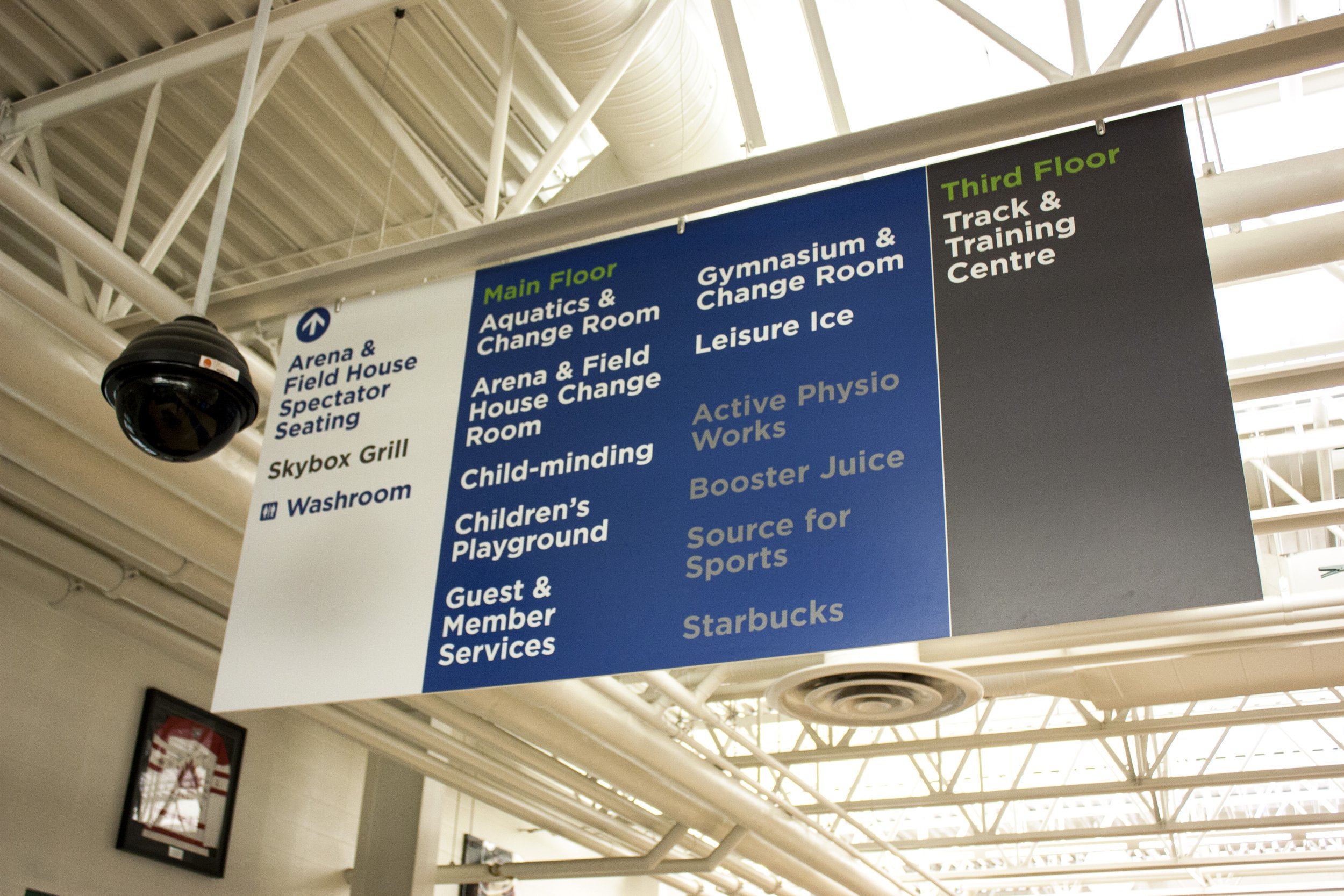
Servus Place is the largest recreation centre in St. Albert, and has undergone numerous rebranding efforts since opening in 2006, resulting in mismatched and inconsistent wayfinding elements. The facility undertook a wide-ranging signage refurbishing effort in 2016 to bring visual communications in line with the current branding standards.
Wayfinding
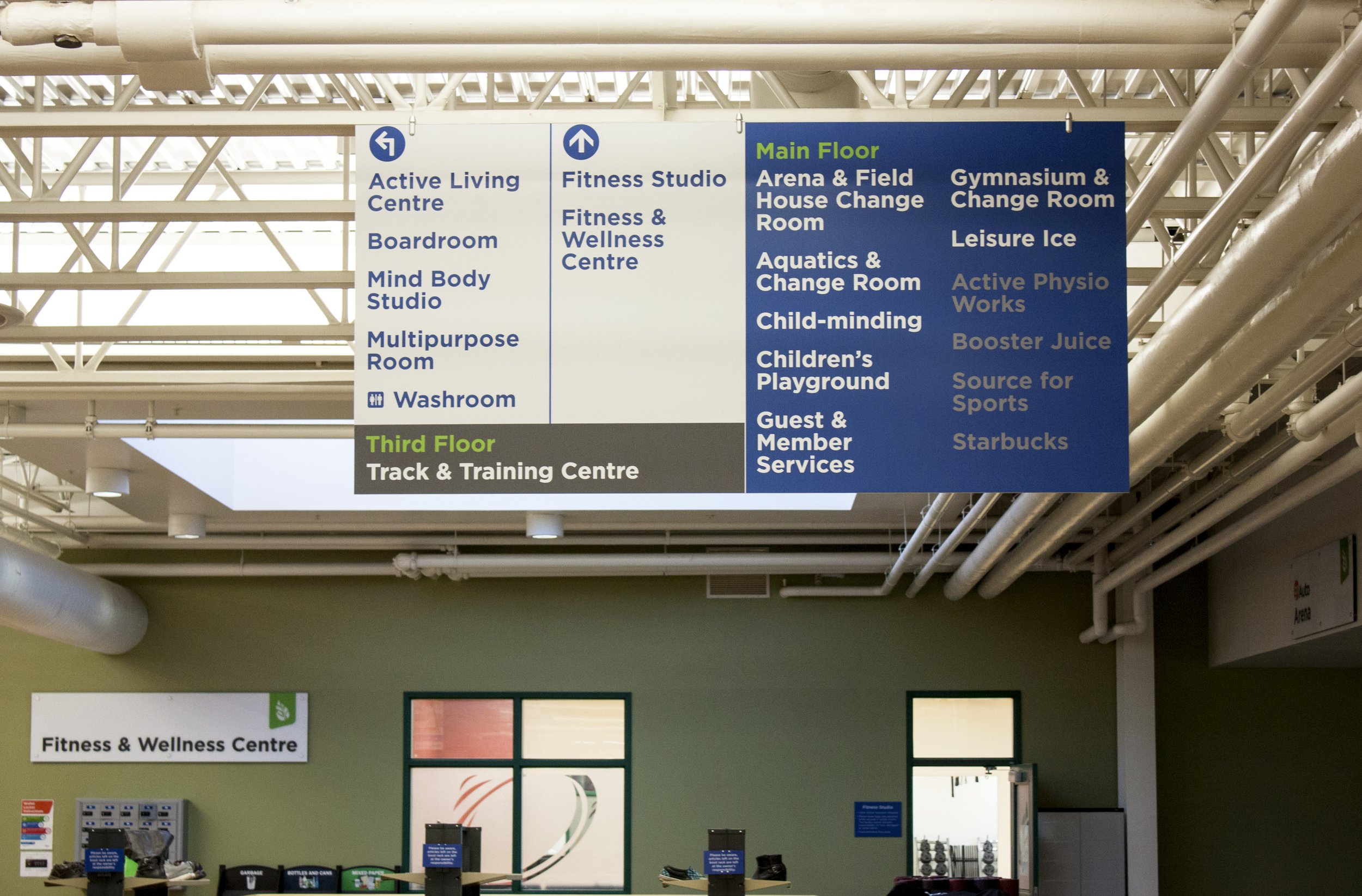
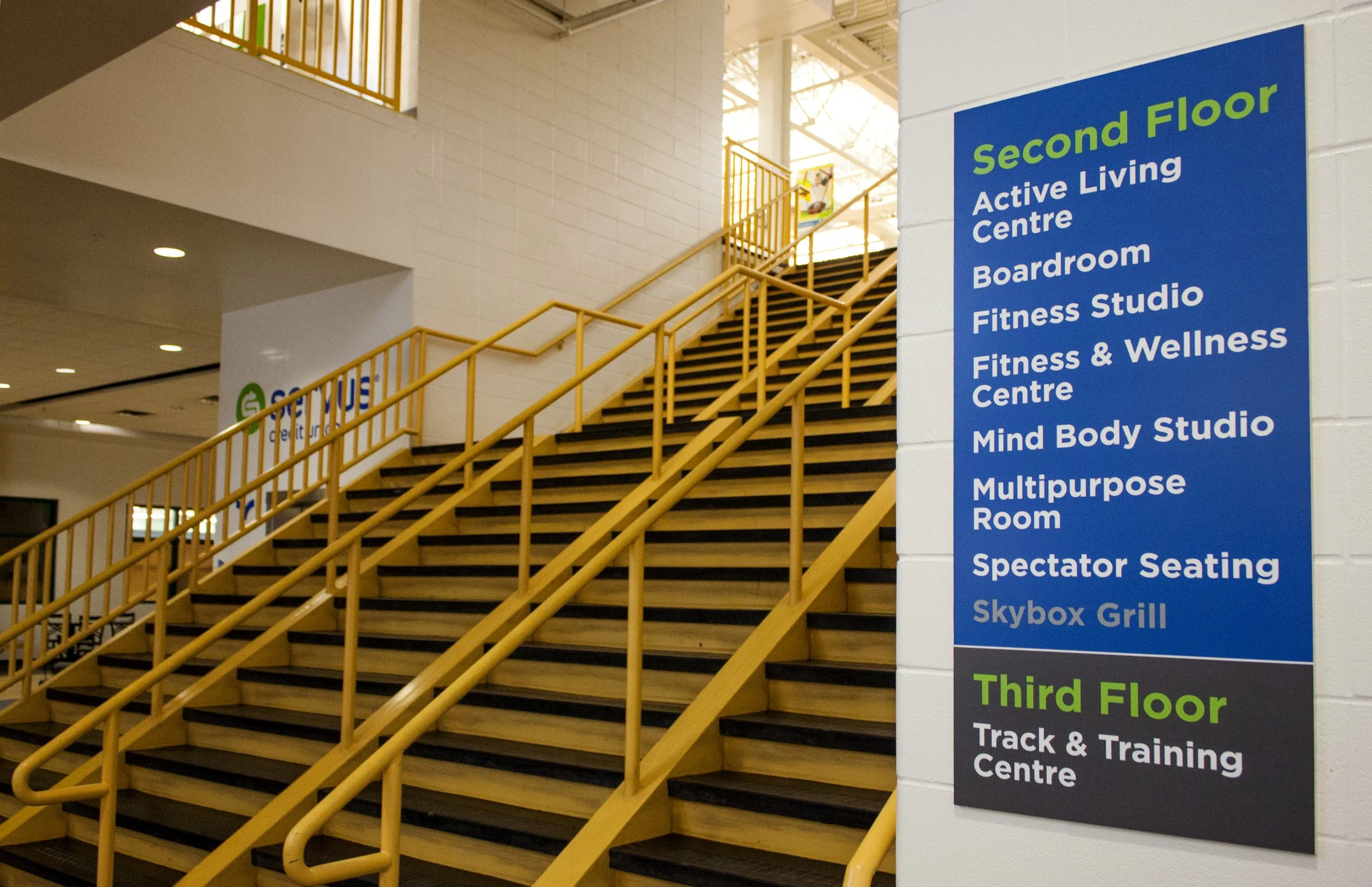
The wayfinding system consisted of hanging signs and wall signs at key decision points inside the centre. The designs were kept simple and used high contrast colours to stand out from other elements in the visual environment. Each sign identified nearby amenities on the same level in alphabetical order, along with high-traffic amenities located on different levels. Floor levels were designated different colours to help with navigation. The signs were produced in plastic sintra and wrapped in vinyl for easier updates in the future.
Recognition Wall
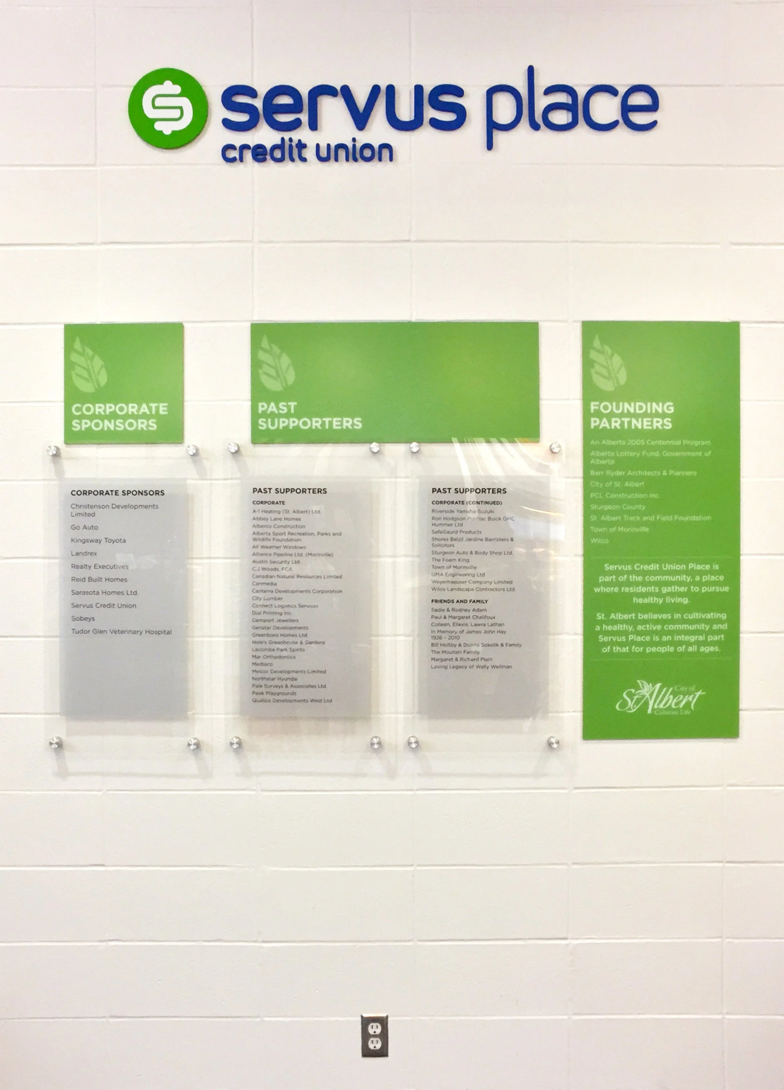
The recognition wall was updated to meet current brand guidelines and also designed to manage name changes and maintenance. Permanent components and hardware were affixed to the wall, and changeable components were installed with spacers for adding to or removing names from the wall. Durable plexiglass was used to prioritize child safety and limit the risk of injury, especially in an active recreational centre.